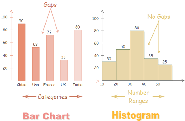
Histograms use bars to visualize data as well. Many people may not even realize there is a difference between a histogram and a bar chart. They practically look the same from a distance.
The key is that a histogram looks solely at quantitative variables while a bar chart looks at categorical variables. That’s why the bars in a histogram are typically grouped together without spacing in between the bars.
Let's plot a histogram now! On calling the hist( ) method on a DataFrame, you'll get histograms for all the Series.

Observations:
- The distribution of the attribute “alcohol” seems to be positively skewed i.e the curve is shifted towards the left.
- The attributes 'density' and 'pH' are quite normally distributed.
- Now looking at the attribute quality, we can observe that the wines with average quality (i.e. quality rating 5 to 7) are more than wines with bad(1-4) or good(8-10) quality.